Showing posts with label cherry picking. Show all posts

Tuesday, May 19, 2020

What's wrong with this picture

In the midst of the COVID-19 pandemic, the Georgia Department of Public Health released the following chart:


They key thing to note are the dates along the bottom.

h/t to Tom Sullivan at Digby's Hullabaloo
Wednesday, September 25, 2013

Climate Change, Arctic Ice, and Statistics


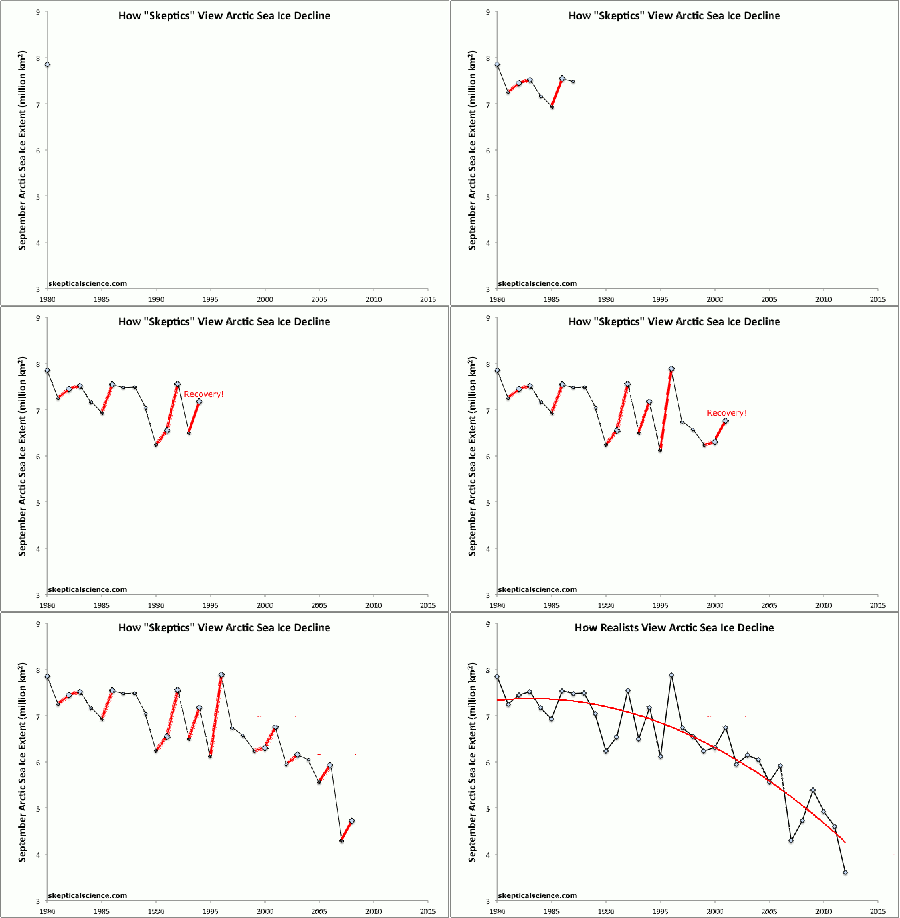
As some of you may know, 2012 was a record low for Arctic sea ice. This year, Arctic sea ice has increased by 60%, and some are using this fact to argue that global warming is not real. However, those making this case do not understand how statistics work. In particular, they fail to understand a statistical phenomenon known as Regression to the Mean. The basic idea here is that if one has a measurement that is particularly extreme, then the next measurement will be much closer to the average or mean. In the case of Arctic sea ice, since 2012 was a record low, we would expect that in the next year we would see an increase. As Dr. Steven Novella puts it in reference to the image above:
Dana Nuccitelli at The Guardian has a nice graphic showing Arctic sea ice trends from 1980 to this year.  In this graph you can see the background fluctuation year to year, but also the clear downward trend overall. Another trend is also apparent – following any year with a record low Arctic ice measurement, the following year is likely to have increased total ice. This is simply regression to the mean. In any fluctuating system, extreme values are likely to be followed more average values. [sic]
The upshot of this is that when we are looking at a complex phenomenon like climate change, we need to look at the whole picture to understand what is going on. If we simply pull out a small segment of the entire picture, say by just focusing on the years 2012 and 2013 (an example of Cherry Picking) it can seem like global warming is on the wane. However, if we pull back and take a broader look we can see that the trend for Arctic sea ice clearly shows that the amount is decreasing over time. And this provides further evidence that global warming is a real phenomenon.

Tuesday, May 28, 2013

How the Wall Street Journal Thinks about Class


How Much Will Your Taxes Jump
This is an oldie that has been sitting in my draft folder for awhile. With the onset of summer, I finally have some time to comments on it. This comes from a story in the Wall Street Journal at the beginning of 2013 discussing the impact of the American Taxpayer Relief Act. Two aspects of this image really stand out.

First, it is worth noting the income levels of the people described in the image. With the exception of the retired couple making $180,000 dollars a year (putting them in the top quintile of income in America), everyone else in the picture is in the top 5%. So, right off the bat the image is heavily skewed in favor of the richest individuals in America, completely ignoring the impact of the legislation on most people in the US. This is a great example of Cherry Picking and Suppression of Relevant Data in that the Wall Street Journal has chosen to highlight economic situations that would be foreign to most of the people affected by the law. This creates a false impression of the impact of the law, making it appear as if most people will be paying more taxes under the new law (of the four situations described, only the retired  couple sees no increase in taxes).

In addition, notice how unhappy all the people in the image are. I am particular impressed by how upset the single person who makes $230,000 a year is. She is incredibly wealthy (in the top income bracket in the US), and I wonder why she is so unhappy. I guess what the chart really indicates is that money can't buy happiness. Snarkiness aside, this chart is clearly created with a particular ideological agenda, one that is strongly opposed to the tax increases incorporated into the American Taxpayer Relief Act. The key point is that the Wall Street Journal created this chart with a certain political agenda in mind, and the chart is designed (through Cherry Picking and Suppression of Relevant Data) to produce the conclusion the editors want. This is just a nice demonstration of how the media is anything but objective and unbiased.

Friday, November 9, 2012

Republican Delusions

Over the course of this election cycle I have written several blog posts looking at Right wing delusions about polling data. I focused quite a bit on Dean Chamber of Unskewedpolls.com and his attempts to "fix" polling data that didn't fit his desired outcome for the election. And now reports are coming in that th Romney campaign itself bought into these delusions, believing that the publicly available polling data (data collected and published by trained professionals with years if not decades of experience) was incorrect and was underestimating the Republican vote. From CBS:
As a result, they believed the public/media polls were skewed - they thought those polls oversampled Democrats and didn't reflect Republican enthusiasm. They based their own internal polls on turnout levels more favorable to Romney. That was a grave miscalculation, as they would see on election night.
This report makes it increasingly clear that the Republican party, even at it highest levels is, quite simply, delusional. On a whole host of issues they have taken positions that have little bearing on reality, and in many cases contradict established facts. The classic example of this is Global Warming, but it extends to a whole host of issues ranging from female anatomy to the policies of Barack Obama. In effect, it appears that the entire Republican world-view is based on wishful thinking and the belief that something must be true because one wants it to be true. We saw this as well on election night with Karl Rove's now legendary refusal to believe that Obama had won the state of Ohio, thus winning re-election:


And this raises an important and disturbing question: What are we to do when one of the two major political parties supports policies and platforms and endorses beliefs that are delusional and have no relation to reality? How can a democracy survive when people are picking their own facts to fit their already established ideological views? If we can't even agree on what the problems are, how can we possibly come up with solutions to them? I have no idea what the answers to these questions might be, but it will be interesting to see if the Republican party modifies any of its views to actually correspond to reality. If history is any guide, they will likely just become more extreme and more delusional.

Monday, September 24, 2012

Big Pharma Hides the Truth

The science columnist, author, and academic Dr. Ben Goldacre, has just written a new book about the pharmaceutical industry, Bad Pharma: How Drug Companies Mislead Doctors and Harm Patients. In connection with the publication of this book, The Guardian has published an excerpt. In this excerpt, Goldacre discusses a number of fallacies regularly committed by the pharmaceutical companies in their efforts to get their drugs approved for use by various government regulatory agencies. We can see these fallacies clearly exemplified in Dr. Goldacre's discussion of the anti-depressant reboxetine.